
After 14 years, Nickelodeon renews identity and logo. The new image is not only fresher, but it also pays homage to the past by bringing back the iconic ‘splat’ effect from its 1993 logo. The network worked with six American and international agencies to develop its new image, and the result is impressive.
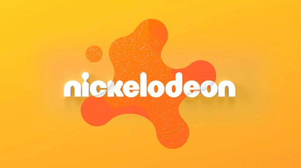
‘Splat’ Effect
The new Nickelodeon logo retains its distinctive typography, but introduces the splatter effect that the company calls ‘splat’. This effect imitates a splash of slime, that colorful modeling clay that kids love to play with. This effect is used throughout the new identity, including the abbreviated version for the avatar.
The ‘Portal to Fun‘ launch campaign was presented with Quartet, the first of five commercials. The commercial shows a bored child at a family dinner who discovers a striking viscous orange stain on the ceiling. The new Nickelodeon logo becomes a magical portal full of fun that transports him to another world.
To develop the new identity, Nickelodeon wanted the six agencies involved to go back to the network’s past and highlight the energy and identity of Nick through its most notable characters: SpongeBob SquarePants, Paw Patrol, Blue’s Clues, Baby Shark, Loud House, and Monster High. After extensive research, the key elements that made the brand iconic were identified, including the color orange, the ‘splat’, the mnemonic, and the brand’s unique voice.

Fresh and Scalable Identity
Nickelodeon’s new identity is fresher and more scalable, with new graphics and glittery splattered colors. The brand wanted to make sure it «personified the symbol» of Nickelodeon and was like a «Portal to Fun«, hence the name of the brand campaign. The five commercials on the air represent the Splat as a gateway to surprising experiences.

The rebrand will be launched internationally in the UK in July, followed by Latin America and other markets until 2023. In summary, Nickelodeon has improved its brand with a fresher image closer to children’s language, more adaptable to different contexts. The ‘splat’ effect, adjusted to the times, is an interesting resource that allows the development of graphic elements with which the brand can grow.